Prime Volt
Brand Identity, Website, Signage & Environmental Graphics
Prime Volt approached REAFE STUDIO seeking a strong, contemporary identity capable of supporting its growth within the electrical sector. Our response was a bold, design-led direction rooted in simplicity, precision and graphic clarity. Drawing influence from modernist design principles and the beauty of refined functional forms, we set out to create a visual language that is both distinct and highly usable.
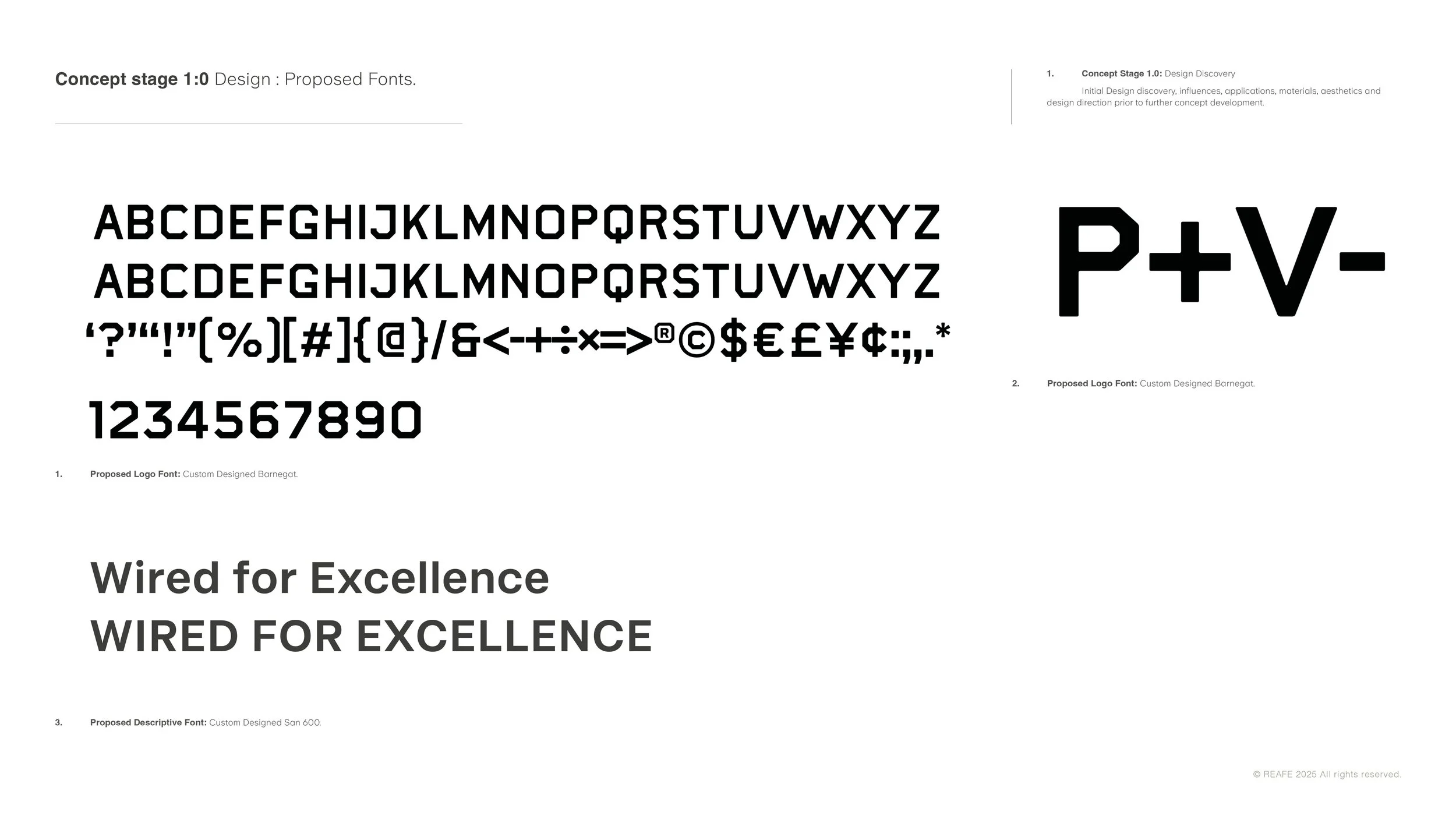
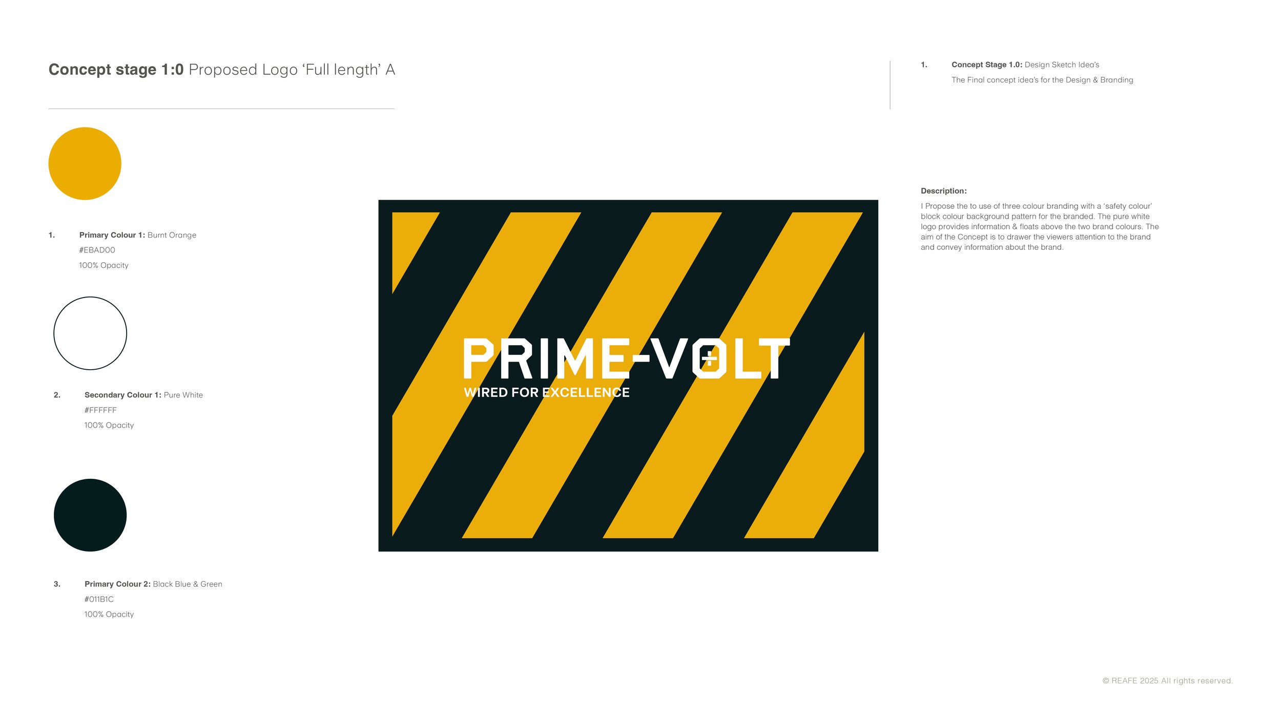
Guided by our six-point design approach, we explored artistic influences, typography, colour development, early sketch ideation and practical application. This process led to a custom logotype supported by a clean, confident type system—delivering a modern and instantly recognisable brand voice.
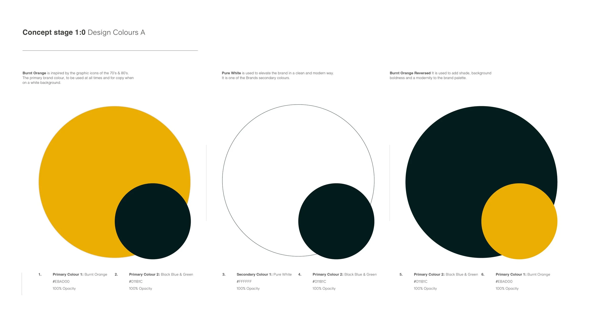
At the centre of the identity sits a dynamic burnt-orange, balanced by deep black-blue tones and pure white. Together, these colours create a palette that is bold, versatile and engineered for clarity across all brand touchpoints.
The resulting identity is cohesive and adaptable, translating seamlessly across digital platforms, vehicles, signage, print, social media and workwear. Designed with longevity and trust in mind, Prime Volt’s new visual system is purposeful, recognisable and reflective of the brand’s commitment to quality and modern electrical craftsmanship.