
Place, Position & Context
STUDIO LOCI — Place, Position & Context
There are names that describe what you do.
And there are names that define how you think.
LOCI sits firmly in the latter.
From the outset, we understood that STUDIO LOCI was not a furniture maker in the conventional sense. It is a practice shaping interior architecture through craft and construction. Each project informed by site. By proportion. By the quiet discipline of making.
Our role was to create a brand system that felt built, not applied.
Grounded in Meaning
The word loci speaks to location and context, to the belief that nothing exists in isolation. Kitchens, cabinetry, interior elements: they are not products. They are responses. We developed a seven-point design approach to ensure clarity of direction, beginning with brand understanding and extending through graphic influence, colour logic, typography, mark-making and application. Every decision filtered through one principle:
If it does not relate to place, craft, or structure — it does not belong.
Craft as Structure
The identity draws from both British vernacular traditions and Japanese philosophies of making — not stylistically, but philosophically. Restraint. Patience. Legibility of construction.
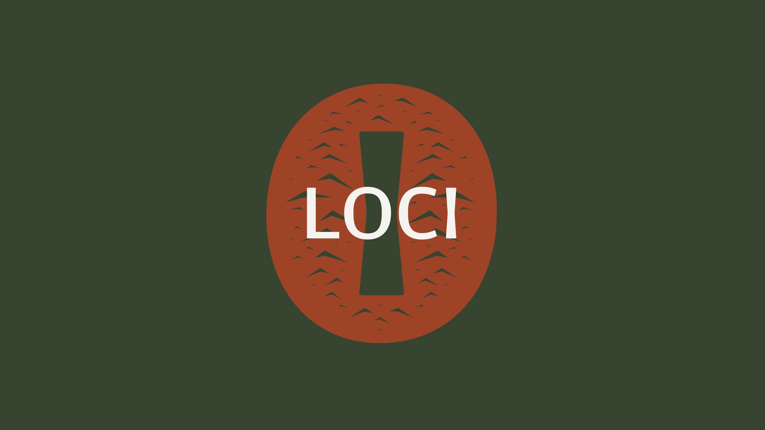
At the centre of the wordmark, the letter “I” is replaced with a butterfly joint.
This is not decoration.
It is a structural reference. A functional detail transformed into symbolic device. A quiet expression of reinforcement and precision. The geometry is embedded within the typography itself, ensuring the brand’s logic mirrors the studio’s craft.
The mark is not placed on top of the brand.
It is constructed within it.
Material Honesty
Colour was treated as material.
Deep Woodland Green anchors the identity referencing East Sussex’s dense woodland and the enduring strength of timber in its natural state. Chalk introduces balance and breath, drawn from the South Downs’ mineral landscape. Sussex Clay adds warmth a restrained accent inspired by terracotta rooftops and the region’s working history.
The palette is grounded, mineral, tactile.
It avoids trend.
It avoids gloss.
It favours permanence.
Typography as Architecture
We explored a wide range of post-war British typographic influences before selecting a final direction rooted in clarity and spatial awareness.
The chosen typeface carries breadth without aggression. It holds space. It allows air between forms. It reflects the meaning of LOCI itself —place, position, context.
Tracking, proportion, and negative space were treated architecturally. Layout behaves like joinery: functional first, refined through restraint.
The brand does not seek attention.
It commands it quietly.
System, Not Style
The STUDIO LOCI identity was designed as a framework rather than a fixed expression. It adapts across signage, digital, print, debossed materials, and social applications without losing coherence.
Whether pressed into timber, reversed in chalk, or presented in deep woodland green, the identity remains legible, assured, and calm.
Luxury here is not loud.
It is found in tolerance.
In touch.
In how something feels after years of use.
A Brand That Is Made
For us, the most important outcome was alignment.
STUDIO LOCI designs and builds with intention. The brand had to do the same.
Nothing ornamental.
Nothing arbitrary.
Nothing without reason.
The result is an identity that feels crafted rather than branded — structured rather than styled — rooted in place and built to endure.