
Why Small Studios Are Challenging Large Agencies
For years, size was seen as a sign of strength in the design industry. Large agencies with big teams and impressive offices projected confidence and authority. But the landscape is changing. Smaller, highly experienced studios are increasingly competing in the same arena, offering flexibility, transparency and carefully assembled networks of specialists. Is the future of design shifting towards smaller, more agile practices?
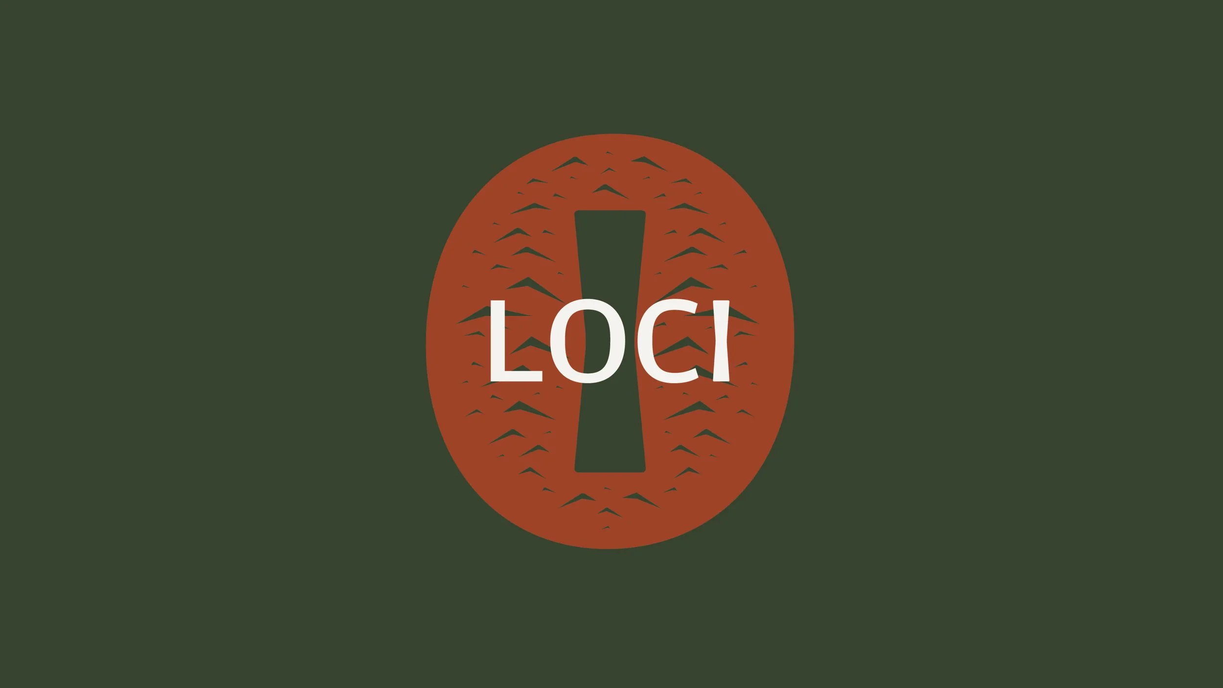
Place, Position & Context
At REAFE STUDIO, we believe brand and build should speak the same language. When commissioned to develop the identity for STUDIO LOCI, we approached the project as we would any architectural brief grounded in context, shaped by material logic, and resolved through proportion. This was never about creating a logo. It was about defining a position.
LOCI derived from genius loci, the spirit of place, became both foundation and framework for a joinery led studio rooted in East Sussex and guided by craft, restraint, and architectural clarity.
Reframing a South London Heritage Brand
A restrained, modern identity for a South London heritage glazier. Inspired by British post-war design, crafted typography and utilitarian colour, Osborn’s is reimagined through clarity, proportion and quiet confidence.

Designing Tradition
For the rebrand of Stenning Roofers, REAFE STUDIO set out to translate generations of heritage craftsmanship into a modern, design-led identity. Known for their precision-led work on historic and listed buildings, the company needed a brand that felt as confident, reliable and craft-focused as the roofs they restore.
Our design direction drew from the material language of the trade — slate textures, clean lines, fine detailing and traditional leadwork — distilling these references into a restrained visual identity. The new branding, typography and colour palette were built to feel honest, grounded and timeless, echoing the character of a craftsman-led business.
We shaped a clear, trustworthy tone of voice to match: direct, knowledgeable and quietly confident. The website follows the same principles, presenting Stenning Roofers’ work with clarity and structure, allowing their expertise to speak for itself.
The outcome is a brand that blends traditional skill with contemporary graphic design — giving a respected heritage roofer a modern identity rooted in craft, precision and integrity.

CURA — A New Automotive Detailing Brand
CURA is a modern automotive detailing brand created by REAFE STUDIO. The project explored how thoughtful graphic design, typography and colour can elevate a detailing service into a confident and recognisable brand.
Drawing inspiration from motorsport culture, historic racing graphics and contemporary design influences, the identity focuses on clarity and simplicity. A bold colour palette, clean typography and subtle references to the polishing process combine to create a brand that feels both technical and refined.
The name CURA comes from the Latin word for care or attention, a concept that sits at the centre of professional vehicle detailing. The resulting visual identity is designed to work across digital platforms, vehicle graphics, uniforms and products, forming a cohesive brand system that reflects the precision and craft of the detailing process.
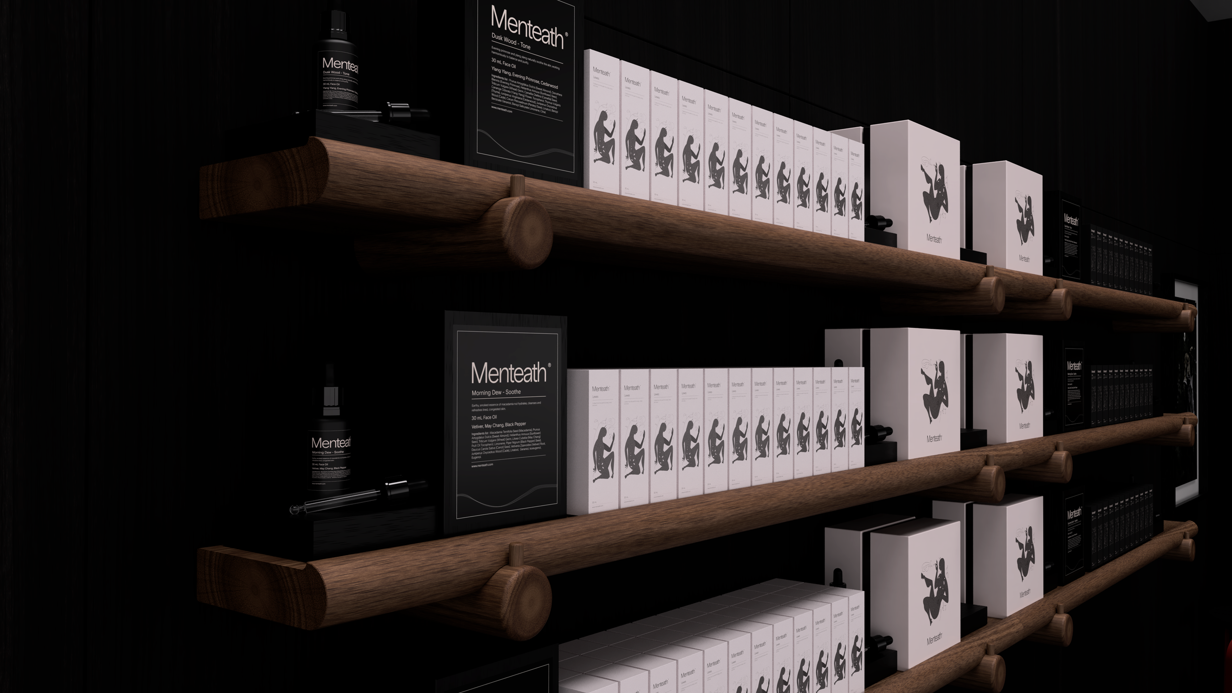
Craft, Clarity, Connection: Designing the Menteath Brand
Some of our most meaningful projects start with a simple conversation. Menteath was one of those. From hand-drawn illustrations to thoughtful typography and packaging, we helped build a brand that feels calm, confident, and connected to nature. Today it reaches customers across the UK and internationally, a testament to careful design and collaboration.