
Reframing a South London Heritage Brand
Osborn’s Glaziers, South Norwood
Osborn’s has been part of South Norwood High Street since 1956. A family business rooted in craft, precision and reliability — a working presence woven into the everyday life of the street. When we were invited to reframe the brand, the brief was not about reinvention, but about refinement: how to evolve a heritage glazing company into a contemporary identity without losing its character, trust and history.
This became a project about continuity, restraint and design integrity.
British Post-War Influence
The visual language for Osborn’s draws directly from British post-war design culture — a period shaped by utility, reconstruction and social purpose. Design in this era was not ornamental; it was functional, honest and human. Influences came from:
The clarity of post-war British typography
The sculptural restraint of post-war British public art
The visual discipline of industrial modernism
This lineage informed an identity that feels useful, enduring and quietly confident — not stylised, not nostalgic, and never decorative.
Typography as Architecture
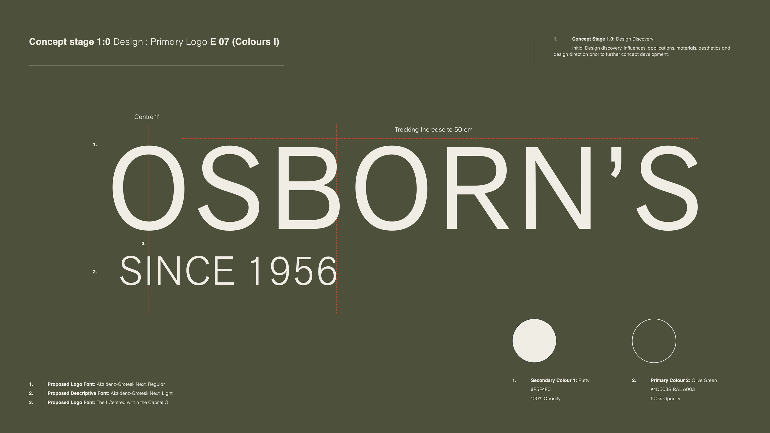
At the centre of the identity sits Akzidenz-Grotesk Next, in Regular and Light weights.
A typeface with deep modernist and post-war roots, it brings:
Clarity
Neutral authority
Timeless legibility
Architectural restraint
It allows the name Osborn’s to carry the brand — not through embellishment, but through proportion, spacing and balance. The centred “I” detail within the O becomes a subtle structural gesture, echoing alignment, craft and construction logic rather than graphic decoration.
Typography here becomes structure — not styling.
Colour as Material Language
The selected palette is drawn from post-war utilitarian colour systems, where pigment was practical, durable and restrained.
The identity colours:
Olive Green — grounded, industrial, stable
Putty — soft, architectural, neutral
These colours reference machinery, tools, uniforms, workshops and working environments — not trend palettes. They are calm, confident and functional, designed to perform across:
Signage
Vehicles
Uniforms
Digital platforms
Building applications
Website environments
Colour becomes a material — not a graphic effect.
Craft, Not Cosmetics
The Osborn’s identity is not brand theatre. It is brand clarity.
Every element is designed to communicate:
Reliability
Precision
Longevity
Trust
Craft
The work extends across:
Branding & visual identity
Typography systems
Colour architecture
Website design
Tone of voice
Building signage
Digital and physical applications
The result is an identity that feels established, credible and contemporary — without losing the DNA of a business that has served its community for nearly 70 years.
A Modern Identity for a Heritage Business
Osborn’s doesn’t need to look new.
It needs to look right.
This project reflects REAFE STUDIO’s belief that the strongest identities are not built through novelty — but through clarity, proportion, restraint and intelligence.
A heritage business reframed through modernist principles.
A local brand elevated through design discipline.
A contemporary identity grounded in British design history.
Quiet.
Confident.
Enduring.