
Craft, Clarity, Connection: Designing the Menteath Brand
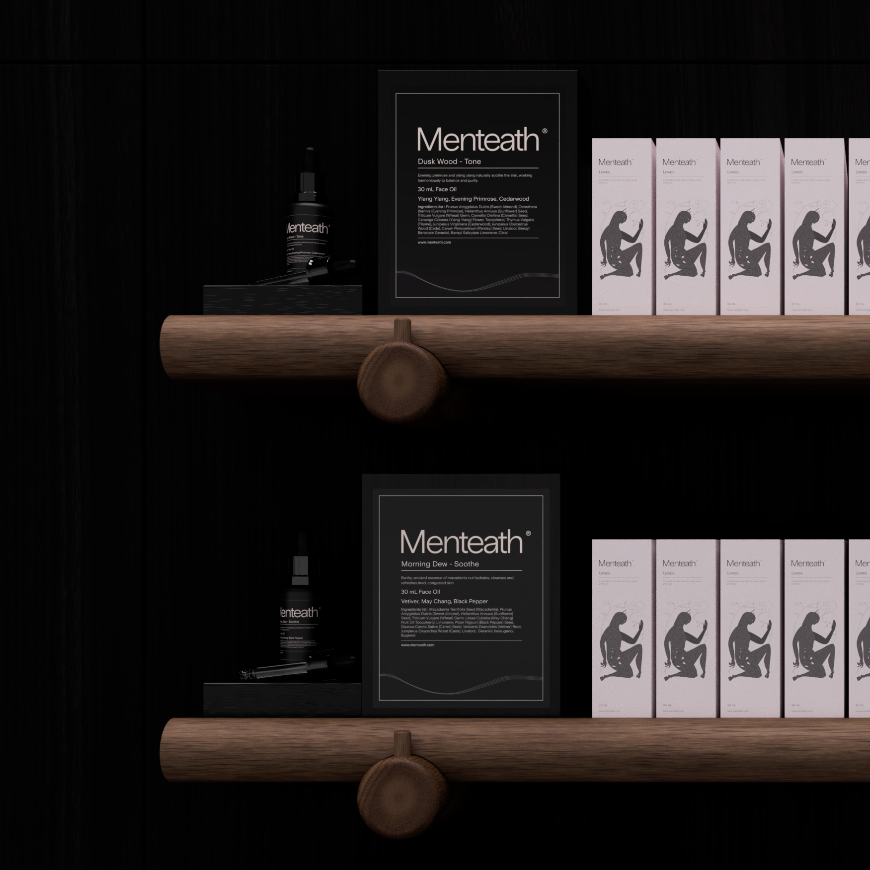
The brief for Menteath was simple in spirit but demanding in execution. The brand needed to feel calm, natural, and confident — a reflection of the products themselves. It had to connect with people without leaning on clichés, and it needed to translate across packaging, print, and retail environments.
Our approach was rooted in craft. Hand drawing and illustration played a central role, giving the brand a human quality from the very start. The botanical illustrations created by Olivia Bullock became a core part of the identity, providing a delicate yet confident visual anchor. Typography and layouts were refined slowly and deliberately, so every detail felt purposeful.
Design for Menteath was always about clarity over noise. Packaging, graphic language, and material choices were considered to reflect the purity of the product and its connection to nature. Every decision reinforced a sense of calm and intention, giving the brand the flexibility to grow organically.
Watching the brand evolve has been incredibly rewarding. What started as a small, local venture has grown to stockists across the UK and around the world. The design foundations we helped create have stood the test of time, allowing the brand to travel far while staying true to its story.
Projects like Menteath remind us why we value craft, collaboration, and multidisciplinary thinking. Design is not just about how something looks; it’s about how it performs, how it communicates, and how it connects people to something bigger.
We are proud to have been part of Menteath’s journey and excited to see where the brand goes next.